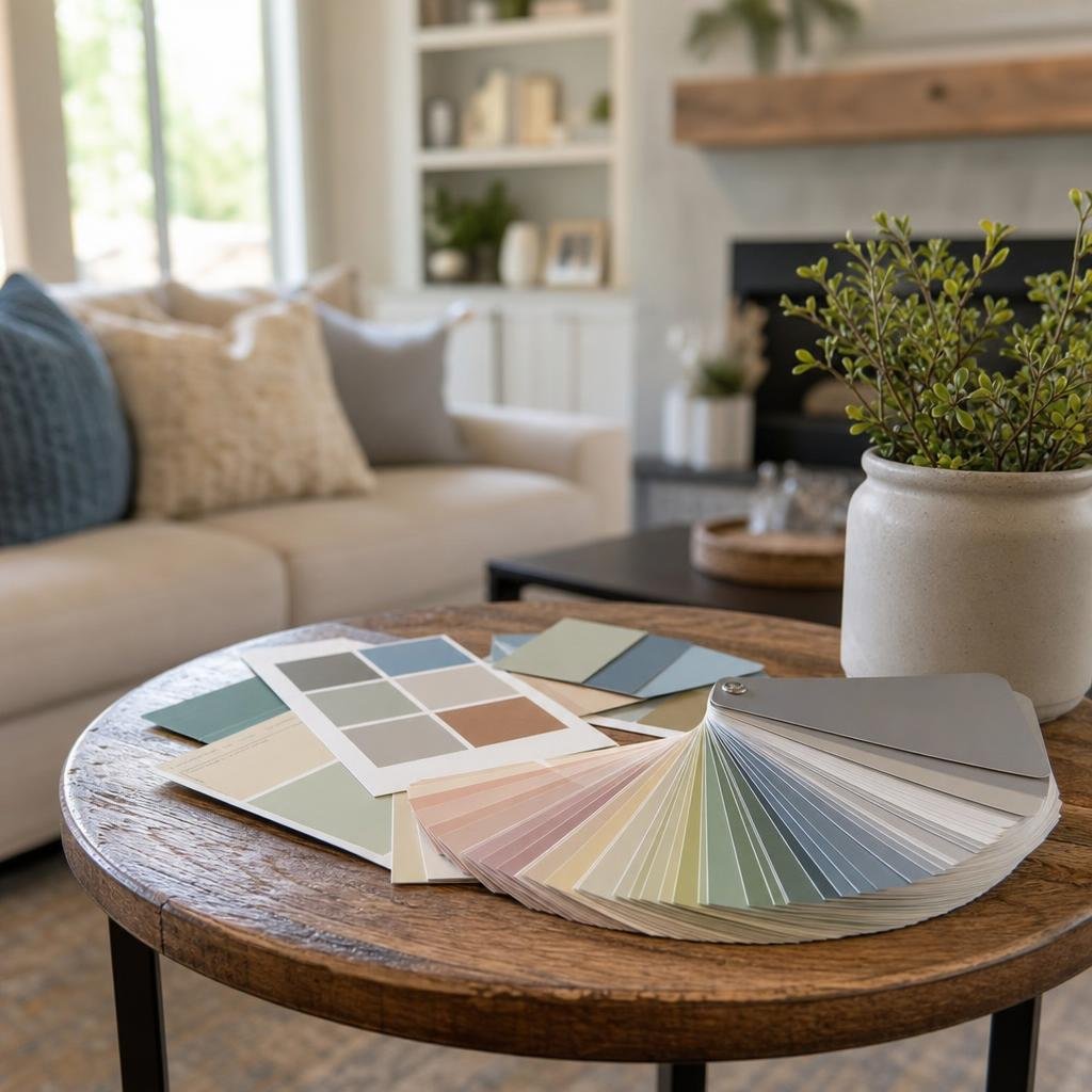
Almost every homeowner who's repainted a room has a story about a color that looked perfect on the chip and completely wrong on the wall. It's not bad taste — it's that a 2x3 inch paper swatch under fluorescent store lighting tells you almost nothing about how that color will actually behave in your living room at 4pm in January. Choosing a color you'll still like in five years takes a little more process than pointing at a fan deck.
Test the Color in the Room, Not on the Chip
Paint chips lie — not on purpose, but because store lighting, the size of the sample, and the surrounding colors on the display all distort how a color reads. Before committing to a gallon, get the color onto your actual wall. Paint a swatch at least a 2-foot square in two or three spots in the room — different walls catch different light — or use a peel-and-stick sample if you want to avoid patchwork on the wall. Then live with it for a few days. Look at it in the morning, at midday, and at night under your lamps. A color that looks calm at noon can turn surprisingly bold or muddy after dark.
Start With What You Can't Easily Change
Before falling in love with a paint color, take stock of your fixed finishes: flooring, cabinetry, countertops, tile, and trim. These are expensive and disruptive to replace, while paint is one of the cheapest, fastest things in your house to change. Let the fixed elements set the direction — pull an undertone from your countertop or a warm note from your hardwood floor — rather than picking a wall color first and hoping everything else falls in line around it.
Understand Undertones and Your Room's Light
Almost every paint color, including whites and grays, has an undertone — a hint of another color hiding underneath it that becomes obvious once it's on a large wall. A "greige" might lean more green or more purple than you expected. Undertones interact with your room's natural light exposure: north-facing rooms get cooler, more diffused light and tend to make colors read cooler and sometimes grayer than they looked in the store. South-facing rooms get warmer, more direct light and can make the same color look warmer and brighter. East- and west-facing rooms shift through the day as the sun moves. Knowing which way your room faces helps you predict how a color will actually behave before you commit.
Use the 60-30-10 Rule to Balance a Room
A simple ratio that interior designers rely on: 60% of the room in a dominant color (usually the walls), 30% in a secondary color (upholstery, curtains, a large rug, or an accent wall), and 10% in an accent color (pillows, art, small decor). This keeps a room from feeling flat or overly matchy, and it gives you a clear place to be bold — the 10% accent — without risking a color you might tire of on every wall.
Don't Overlook Sheen
The same color in flat, eggshell, satin, and semi-gloss will all look slightly different because sheen changes how light bounces off the surface. Flat finishes absorb more light and read more muted and true-to-swatch; higher sheens reflect more light, which can make a color look brighter or slightly different depending on the angle you're viewing it from. Sheen also affects durability and cleanability — higher-traffic rooms like kitchens, bathrooms, and hallways usually benefit from a more washable satin or semi-gloss, while bedrooms and formal living spaces can stay flatter and softer.
When in Doubt, Get a Second Opinion
Even with a solid framework, picking the right color for a whole room or a whole house is still a judgment call, and a lot of homeowners spend more time and money on trial-and-error sampling than they expect. A professional color consultation can shortcut that process considerably — someone who does this daily can look at your fixed finishes, your lighting, and your furniture and narrow a wall of hundreds of options down to a handful that will actually work. We offer a free color consultation for exactly this reason: it takes the guesswork out before a single gallon gets opened.